Tkinter 8.6 Quick
Reference
Tkinter is a module for building graphical user
interfaces. It is included in Python's standard library.
This is a summary of some useful classes and
methods in Tkinter. For more complete information, see the pages
TkDocs and Tkinter
8.5 Reference,
plus the Tkinter
documentation
in the Python library reference.
Unless other specified, the classes below live in
the ‘tkinter‘ and 'ttk' packages. Typically at the top of your
program you will write
from tkinter import *

from tkinter import ttk
so that you can easily access these classes.
contents
- topics
-
colors | fonts
| grid | events
| dialogs
-
classes
-
BooleanVar
| Button
| Canvas (image
| line | oval
| polygon | rectangle
| text) | Checkbutton
| Entry
| Event
| Font
| IntVar
| Label
| Listbox
| Menu
| Misc
| PhotoImage
| Radiobutton
| Scrollbar
| StringVar
| Tk |
Variable
| Widget
class hierarchy
Event
Font
Misc
  Tk
  Widget
    Button
    Canvas
    Checkbutton
    Entry
    Label
    Listbox
    Menu
    Radiobutton
    Scrollbar
PhotoImage
Variable
  BooleanVar
  IntVar
  StringVar
colors
Some of the methods below accept colors. In
Tkinter, a color is a string which can be either of the
following:
A
well-known color name such
as ‘white’, ‘yellow’, or ‘blue’.
A
string of the form #rrggbb
where
rr,
gg
and
bb
are
two-digit hexadecimal numbers representing the red, green and blue
components of the color.
fonts
To be able to access font-related
functions, write this at the top of your program:
from tkinter import font
-
font.nametofont(fontname)
-
Given a font name, return a Font
object.
Built-in font names include
- TkDefaultFont
-
The default font.
grid
Tkinter supports several different geometry
managers for arranging widgets. A widget will appear only
after you register it with a geometry manager.
In this quick reference we will only discuss the
grid() geometry manager. To register a widget with this geometry
manager, call the
grid() method and specify any
number of grid options. You can modify a widget's grid options at any
time by calling the gridconfigure()
method.
grid options
- column
-
The column number at which a widget should be placed. Columns are
numbered from zero.
-
columnspan
-
The number of columns that the widget should occupy, i.e. its width
in cells. The default is 1.
-
padx
-
X padding: a number of extra pixels to place to the left and right
of the widget.
-
pady
-
Y padding: a number of extra pixels to place above and below the
widget.
-
row
-
The row number at which a widget should be placed. Rows are numbered
from zero.
-
rowspan
-
The number of rows that the widget should occupy, i.e. its height in
cells. The default is 1.
-
sticky
-
The side(s) of the grid cell (N, S, E, or W) where the widget should
be positioned, i.e. to which it should stick. This may be either a
single value such as S, or a tuple such as (N, S, W). If this option
is not specified, the widget will be centered in its cell.
events
Tkinter lets you register event handlers which
run in response to events.
Some kinds of widgets have configuration options
that lets you specify handlers for specific kinds of events. For
example, the Button widget has a configuration option named "command"
that specifies a handler to run when the button is pressed.
More generally, you can call the bind()
method on a widget to register a handler for any event. After
that, whenever
the event occurs on that widget, the event handler will run and will
receive an Event object with
details about the event.
event types
- <Button>
-
The user has pressed
a mouse button. The 'x' and 'y' attributes of the Event
object will contain the mouse coordinates.
-
<ButtonRelease>
-
The user has released a
mouse button. The 'x' and 'y' attributes of the Event
object will contain the mouse coordinates.
-
<Configure>
-
A widget's size has changed.
-
<Enter>
-
The user has moved the mouse pointer into a widget.
-
<KeyPress>
-
The user has pressed
a key. The 'char' and 'keysym' attributes of the
Event object will contain the
character (if any) and key
name of the key that was pressed.
-
-
Every key
name is also a more specific event type that
occurs only when that particular key is pressed. For example, the
event <Left> occurs only when the user presses the left arrow
key.
-
-
By default, these events will arrive at the top-level Tk window.
-
<KeyRelease>
-
The user has
released a key. The 'keysym' attribute of the
Event object will contain the key
name of the key that was pressed.
-
-
By
default, this event will arrive at the top-level Tk window.
-
<Motion>
-
The user has moved the mouse. The 'x' and 'y' attributes of the
Event object will contain the
mouse coordinates.
key names
- Down
-
The down arrow key.
-
Left
-
The left arrow key.
-
Return
-
The Enter key.
-
Right
-
The right arrow key.
-
space
-
The space bar.
-
Up
-
The up arrow key.
dialogs
A dialog box is a secondary window that
appears over the main window of an application. Tkinter includes
several built-in dialog types.
message boxes
A message box is a dialog that displays a text
message, plus one or more buttons that the user can press to dismiss
the dialog.
To use message boxes, write this at the top of
your program:
from tkinter import messagebox
-
messagebox.showerror(message = text)
-
Display a message box showing the given text, plus an icon
indicating that an error has occurred. The box will have an OK
button.
-
messagebox.showinfo(message = text)
-
Display a message box showing the given text, plus an icon
indicating that the text is informative. The box will have an OK
button.
class BooleanVar(Variable)
An object that holds a boolean value to be
displayed in one or more widgets.
class ttk.Button(Widget)
A pushbutton.
- ttk.Button(parent, option = value,
…)
-
Create a Button.
-
Button options
- command
-
A function to be called when the button is pressed.
-
text
-
A string to display on the Button.
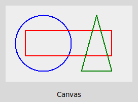
class Canvas(Widget)
A canvas is a rectangular area where you can draw
graphics in the form of canvas
items which
represent shapes or images. Each canvas item is
represented by an integer ID.
Each
canvas item has
various configuration
options which
you can set when you create an item, and which you can modify later
using the itemconfigure() method of the Canvas class.
- Canvas(parent, option
= value, ...)
-
Create a Canvas widget.
Canvas options
These are options
of
the Canvas itself, not of
individual items.
- bg or background
-
The background color of the canvas. The default is a light gray
color.
-
height
-
The canvas height in
pixels.
-
width
-
The canvas width in pixels.
Canvas methods
- .coords(id, x0, y0, x1, y1, …, xn, yn)
-
If you pass only an id, the method will return a tuple containing
the coordinates of a canvas item. If you pass an id plus
coordinates, the coordinates of the given canvas item will be
updated. In either case, the number of coordinates will depend on
the item type.
-
.delete(id)
-
Delete
an item from the canvas. If id
is
'all', all canvas items will be deleted.
-
.find_overlapping(x0, y0, x1, y1)
-
Return a sequence of ids of all canvas items that overlap the given
rectangle. The items are returned in Z-order, with the lowest item
first in the sequence.
-
.itemconfigure(id, option
= value, …)
-
Modify one or more options
of a canvas item.
-
.move(id,
dx, dy)
-
Move a canvas item by the given offset dx/dy in
pixels.
-
.tag_bind(id, event, func)
-
Register an event handler that will run when the given event occurs
on the canvas item with the given id. Typically you'll use this for
registering a handler for a <Button> event. (Note
that if the user clicks on an item, a <Button> event
will occur only if the interior of the item is visible, i.e. not
transparent.)
image items
- id = canvas.create_image(x,
y,
option
= value,
…)
-
Create
an image item
on
a canvas.
image item options
- image
-
The image to be displayed. This can be a PhotoImage
object.
-
Note that a canvas image item does not keep a reference to the image
object (e.g. a PhotoImage) that it is displaying. This means that
some other reference to the image object (e.g. a global variable or
object attribute) must exist for as long as you want to display the
image. If there are no references to the image object, Python's
garbage collector will free it and the image will not be displayed.
line
items
- id =
canvas.create_line(x0,
y0,
x1,
y1, option
=
value,
...)
-
Create
an item representing a line from (x0,
y0)
to (x1, y1).
line item options
- fill
-
The color in which to draw the line. The default is ‘black’.
-
width
-
The line width in pixels. The default is 1.
oval
items
An oval item
represents an ellipse, of which a circle is a special case.
- id = canvas.create_oval(x0,
y0, x1, y1, option
= value, …)
-
Create an oval item
on a canvas. (x0, y0) is
the upper-left corner of the oval’s bounding box, and (x1, y1)
is the lower-right
corner.
oval item options
- fill
-
The color with which the oval should be filled. The
default value is the empty string, which makes the interior of the
oval transparent.
-
outline
-
The color of the border
around the oval. The default is ‘black’.
-
width
-
The width in pixels of the border around the oval. The default is 1.
If you set this option
to 0, there will be no border.
polygon items
A polygon item is defined by a series of points
(x0, y0), (x1, y1), …, (xn, yn). There are lines from (x0, y0) –
(x1, y1), from (x1, y1) to (x2, y2), and so on, including a final
line from (xn, yn) back to (x0, y0).
- id = canvas.create_polygon(x0,
y0,
y1,
y1,
…, option
=
value,
…)
-
Create a polygon item on a canvas.
polygon item options
- fill
-
The color with which the polygon
should be filled. The default color is 'black'. You can specify the
empty string to make
the interior of the polygon
transparent.
-
outline
-
The color of the border
around the polygon.
The default value is
the empty string, which makes the border
transparent.
-
width
-
The width in pixels of the border around the polygon.
The default is 1. If you set this option
to 0, there will be no border.
rectangle items
- id =
canvas.create_rectangle(x0,
y0,
x1,
y1,
option
=
value,
…)
-
Create
a rectangle item on a canvas. (x0,
y0)
and (x1,
y1)
are
coordinates
of opposite corners of the rectangle.
rectangle item options
- fill
-
The color with which the rectangle should be filled. The default
value is the empty string, which makes the interior of the rectangle
transparent.
-
outline
-
The color of the border
around the rectangle.
The default is ‘black’.
-
width
-
The width in pixels of the border around the rectangle.
The default is 1. If you set this option
to 0, there will be no border.
text items
- id = canvas.create_text(x,
y, option
= value, …)
-
Create a text item
on a canvas. The text will be centered at the position (x, y).
text item options
- text
-
The text to display.
class ttk.Checkbutton(Widget)
A button that can be toggled on and off.

- ttk.Checkbutton(parent, option =
value, …)
-
Create a Checkbutton.
Checkbutton options
- text
-
A label for the button.
-
variable
-
A BooleanVar that holds the button's toggle state.
class ttk.Entry(Widget)
A single-line text box.
- ttk.Entry(parent, option = value,
…)
-
Create an Entry.
Entry options
- textvariable
-
A StringVar that holds the text displayed in this Entry.
class Event
An event that has occurred. Event attributes
include the following:
- .char
-
The character of the key that was pressed (in a KeyPress event) or
released (in a KeyRelease event), if that key represents an ASCII
character.
-
.keysym
-
The name of the key that was
pressed (in a KeyPress event) or released (in a KeyRelease event).
-
.x
-
The x position of the mouse at the moment the event occurred,
relative to the upper-left corner of the widget.
-
,y
-
The y position of
the mouse at the moment the event occurred, relative to the
upper-left corner of the widget.
class Font
A font for displaying text. You can retrieve a
Font object by calling the nametofont()
function.
Font options
Font options
describe a font, and can be set using the configure() method.
- size
-
The size of a font in points.
Font methods
- .configure(option
= value, …)
-
Set one or more options on
a Font.
class IntVar(Variable)
An object that holds an integer value to be
displayed in one or more widgets.
class ttk.Label(Widget)
A text label.
- ttk.Label(parent, option = value,
…)
-
Create a Label.
-
Label options
- text
-
A string that the Label should display.
-
textvariable
-
A Variable whose value the
Label should display.
class Listbox(Widget)
A list of text items that lets the user select one
or more items.
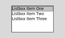
- Listbox(parent, option = value,
…)
-
Create a Listbox.
-
Listbox options
- height
-
The number of lines (not pixels!) shown in the listbox. The default
is 10.
-
listvariable
-
A StringVar whose value is a list of strings to display in the
listbox.
-
selectmode
-
Determines whether the user can select multiple items in the list.
The default value is BROWSE, in which only one item can be selected
at a time. If set to EXTENDED, the user will be able to select
multiple items.
-
width
-
The width of the listbox in characters (not pixels!). The default is
20. The width is measured in terms of the width of an average
character, so not all strings of the given length are guaranteed to
fit.
-
yscrollcommand
-
To make a listbox vertically scrollable, set this option to the
'set' method of the associated scrollbar.
Listbox methods
- .curselection()
-
Return a tuple containing the (0-based) indices of the item(s) in
the listbox that are currently selected.
-
.selection_clear(i)
-
Deselect the item with index i.
-
.selection_set(i)
-
Select the item with index i.
-
.yview()
-
To make a listbox vertically scrollable, set the 'command' option of
the associated scrollbar to this method.
Listbox events
- <<ListboxSelect>>
-
Fires when the user has changed the selection in the listbox.
class Menu(Widget)
A menu, which may be either the top-level menubar
itself or one of the
menus in it.
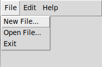
- Menu(parent, option = value,
...)
-
Create a menu. If parent is the top-level window, this will
create a top-level menubar; you will need to set the top-level
window's 'menu' option to this menubar in order for it to be
visible. If parent is
the top-level menubar, this will create a menu that can be added to
the menubar via the add_cascade() method.
Menu options
- tearoff
-
True if a menu can be torn off, i.e. dragged
from its parent into a separate window. Unfortunately the
default value of this option is True. I recommend that you set this
option to False for all menus by calling
root.option_add('*tearOff',
False).
Menu methods
- .add_cascade(label = string,
menu = menu)
-
Add a submenu to a menu. Typically you will use this method to add
menus to the top-level menubar.
-
.add_command(label = string,
command = function)
-
Add a command to a menu. When the user selects it, the given
function will be called with no arguments.
class Misc
This class contains methods which are present in
all widgets and also in the top-level window (since both Widget and
Tk are subclasses of this class).
- .after(delay_ms, callback)
-
Run the given callback function after delay_ms milliseconds
have elapsed.
-
.bind(event, func)
-
Register an event handler that will run when a certain event occurs
on this widget. event is a string representing an event
type. func is an event handler function. It should take a
single argument representing an Event object.
-
.cget(option)
-
Given
an option name (a string), return the value of the option as a
string. Alternatively,
the
syntax 'w[option]' will
also return an option value for a widget w.
-
.configure(option =
value,
…)
-
Set the values of one or more options for this widget.
Alternatively, the syntax 'w[option] = value' will also set an
option value for a widget w.
-
.destroy()
-
Destroy a widget and all its children. If this method is invoked on
the top-level window, the program will exit.
-
.option_add(pattern, value)
-
Add a default value for all options whose names match a pattern. For
example,
root.option_add('*tearOff', False)
will set the value of the tearOff option to be False by default for
all widgets. -
.winfo_children()
-
Return a list of all children of this widget.
class PhotoImage
A PhotoImage represents a raster image loaded from
a .gif or .png file. You can display a PhotoImage using an image item
on a Canvas.
- PhotoImage(file = filename)
-
Create a PhotoImage loaded from the given filename.
class ttk.Radiobutton(Widget)
A group of radiobuttons allows the user to select
one of several choices.

- ttk.Radiobutton(parent, option =
value, …)
-
Create a Radiobutton.
-
Radiobutton options
- text
-
The text to display beside this button.
-
value
-
A value associated with this choice.
-
variable
-
A Variable that will receive this choice's value if it is selected.
class ttk.Scrollbar(Widget)
A Scrollbar can be attached to certain widgets
(such as Canvas and Listbox widgets) to make them scrollable.
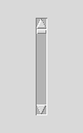
For example, you might create a vertical Scrollbar
and attach it to an existing Listbox widget like this:
scroll = ttk.Scrollbar(root, orient = VERTICAL, command = listbox.yview)
scroll.grid(row = 0, column = 1, sticky = [N, S, W])
listbox['yscrollcommand'] = scroll.set
-
ttk.Scrollbar(parent, option = value, …)
-
Create a Scrollbar.
Scrollbar options
- command
-
A function that will be called when the scrollbar moves. Generally
this should be w.xview or w.yview, where w is
the widget that should scroll.
-
orient
-
The orientation of the scrollbar: either HORIZONTAL or VERTICAL. The
default is VERTICAL.
class StringVar(Variable)
An object that holds a string to be displayed in
one or more widgets.
class Tk(Misc)
A top-level window.
- Tk()
-
Create a top-level window.
Top-level options
- menu
-
A Menu object representing
the top-level menubar.
Top-level methods
- .mainloop()
-
Run the main event loop.
-
.title(text)
-
Set the top-level window title.
class Variable
A Variable is an object that holds a value to be
displayed in one or more widgets. (In some Tkinter documentation this
is called a control variable.) Subclasses such as IntVar
and StringVar hold
values of specific types.
- .get()
-
Return the current value.
-
.set(value)
-
Set a new value. Any widgets that are displaying this value will
automatically be updated.
class Widget(Misc)
A widget is a visual element such as a button, a
menu, or a canvas. Classes such as Button or Canvas are subclasses of
this class.
Each widget has
various configuration options that
affect its appearance. When you call a constructor to create a
widget, you
can specify options using keyword arguments. After a widget w exists,
the syntax 'w[o]' will return
the value of option
o as
a string, and you can assign 'w[o] = value'
to update the option value.
Alternatively, you
can get an option value by calling the w.cget() method, and update an
option value via w.configure().
- .grid(option
=
value,
…)
-
Register a widget
with the grid() geometry manager and set any number of grid options
for the widget.
-
.grid_configure(option =
value,
…)
-
Set the values of one or more grid options for this widget.