MoveTo before a call to ShowText)
to the leftmost part of the text glyphs.
YBearing
is
negative, and XBearing
is
slightly negative: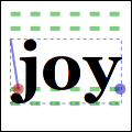
GtkSharp is a C# binding to GTK 3. This quick reference lists a number of fundamental classes and methods in GtkSharp, which should be adequate for writing many programs.
Unfortunately there is no official API documentation for GtkSharp. If you want to go beyond what's listed here, you could look at the GTK 3 API documentation for C or for Python, since most GTK class/method names in C# will be similar (especially to the Python-based API). Or you can look at the older Gtk# 2 documentation, since many GTK 2 classes and methods also exist in GTK 3.
All properties and methods below are public unless otherwise specified.
CairoColor |
Context | Gradient
| ImageSurface |
LinearGradient
| Pattern | PointD
| RadialGradient
| Rectangle | Surface
| TextExtentsGdkCairoHelper
| Event | EventButton
| EventKey | EventMask
| EventMotion |
EventScroll | Key
| Pixbuf
|
Rectangle | RGBAGLibTimeout |
TimeoutHandlerGtkAlign
| Application |
Box
	|
Button
| Calendar
| CellRendererText |
CheckButton |
ColorChooserDialog
| ComboBoxText |
Container | Dialog
| DrawingArea
| Entry
| FileChooserDialog
| Fixed
| Grid | Image
| ITreeModel
|
	Label |
ListStore | Menu
| MenuBar | MenuItem
| MessageDialog |
Orientation
	|
RadioButton
| ResponseType
| Scale | ScrolledWindow
| Separator |
SeparatorToolItem
| SpinButton
| Stock | TextBuffer
| TextIter |
TextView
	| Toolbar |
ToggleButton
	|
ToggleToolButton
| ToolButton |
ToolItem |
TreeIter
	| TreePath |
TreeSelection
	|
TreeView
| TreeViewColumn | Widget
| WindowWidget
Button
ToggleButton
CheckButton
RadioButton
Calendar
Container
Box
ComboBoxText
Grid
ScrolledWindow
Toolbar
ToolItem
SeparatorToolItem
ToolButton
ToggleToolButton
Window
Dialog
ColorChooserDialog
FileChooserDialog
MessageDialog
DrawingArea
Entry
SpinButton
Image
Label
MenuBar
MenuItem
Scale
Separator
TextView
TreeViewCairo is a library for drawing 2-dimensional graphics. GTK integrates closely with Cairo, and most GTK applications use Cairo for visual output.
A color, with red, blue, green, and alpha components, each in the range from 0.0 to 1.0. Alpha represents transparency; a color with alpha = 1.0 is opaque, and a color with alpha = 0.0 is completely transparent.
There's also a Color class in the Gdk namespace, so you will probably want to choose this one explicitly:
using Color = Cairo.Color;
A Context is used for
drawing graphics. Typically you
will use a Context object
to draw on a window in the
OnDrawn
handler of a Widget subclass.
Be aware that methods such as Arc(),
LineTo() and Rectangle()
do not draw - they merely add a geometric shape to the current
path. After you call these methods, you must call either Stroke()
or Fill() to draw to the output surface.
Surface.
When you are finished with the context, you should call Dispose() to
free it.angle1 to angle2
to the current path, centered at (xc, yc). To draw a circle, pass
angle1 = 0.0 and angle2
= 2 * Math.PI.LineTo
behaves like MoveTo.)
family should be a generic font family
such as "serif", "sans-serif" or "monospace",
or the name of a specific font family available on your system.
slant
should be FontSlant.Normal or
FontSlant.Italic.
weight should be
FontWeight.Normal or FontWeight.Bold.
Surface as a source for
drawing at the position (x, y) in the destination. Typically
you will make a following call to Paint()
to perform the actual drawing operation.TextExtents object with
information about the size of the given text in the currently
selected font.A gradient is a pattern in which points smoothly transition from one color to another.
offset
is a value in the range 0.0 … 1.0.An ImageSurface is a
Cairo surface that holds pixel data in memory. You can draw onto an
ImageSurface, and then later
use the ImageSurface as
a source for other drawing operations.
ImageSurface with the given
width and height. Typically
Format will
be either Format.Rgb24,
meaning 24-bit color with 8 bits for each color channel (red, green,
blue), or Format.Argb32,
which is similar but also includes an 8-bit alpha (transparency)
channel.A gradient that extends along a line.
A Pattern is a source for drawing, such as a solid color or a gradient.
A PointD represents an (x, y) point. (The "D" stands for "double".)
A gradient that extends from one circle to another.
A Rectangle represents a rectangle on the (x,y)
plane. Note that this class (Cairo.Rectangle)
is distinct from Gdk.Rectangle, which
appears below.
An abstract base class for any kind of surface on which Cairo can draw, such as an ImageSurface.
A TextExtents
structure represents layout information about a particular piece of
text. Be aware that the values in this structure are sizes in screen
pixels, independent of any coordinate transformation in the graphics
context.
MoveTo before a call to ShowText)
to the leftmost part of the text glyphs.
YBearing
is
negative, and XBearing
is
slightly negative:
Here is how to draw a string s centered at the point (x, y):
TextExtents te = context.TextExtents(s);
context.MoveTo(x - (te.Width / 2 + te.XBearing),
               y - (te.Height / 2 + te.YBearing));
context.ShowText(s);GDK is a low-level library that sits underneath GTK.
This class contains a few static utility methods for working with Cairo.
There's also a CairoHelper class in the Gtk namespace, so you will probably want to choose this one explicitly:
using CairoHelper = Gdk.CairoHelper;
Pixbuf to use for drawing to a
Cairo context at position (x, y). Typically you will follow this
with a call to context.Paint() to draw
the image.An input event.
An event that occurs when a mouse button has been pressed or released.
uint Button { get; }ModifierType State { get; }ModifierType is an enumeration
including values ControlMask and
ShiftMask.EventType Type { get; }
EventType.ButtonPress
EventType.ButtonRelease
EventType.TwoButtonPress
(a double click)
EventType.ThreeButtonPress
(a triple click)
ButtonPress event
for each click, and also a TwoButtonPress
event.double X { get; }
double Y { get; }An event that occurs when a key has been pressed or released. This event will be delivered to the widget that currently has the input focus. The top-level window has focus by default. If the user clicks in a control such a Gtk.Entry, that control will receive the focus so that the user can type there.
Key Key { get; }An enumeration with one value for each possible event type, including
ButtonPressMask
ButtonReleaseMask
PointerMotionMask
ScrollMask
An event that occurs when the user has moved the mouse.
double X { get; }
double
Y { get; }An event that occurs when the user has rotated the scroll wheel.
ScrollDirection
is an enumeration including values Up
and Down.double X { get; }
double Y { get; }An enumeration with one value for each key that can be typed. Some useful values include
a, b,
…, z, A,
B, …, Z
Key_0, Key_1,
Key_2, …, Key_9
Up, Down,
Left, Right
(arrow keys)
space
Return (i.e. the
Enter key)
Delete
See the full list of values here.
There is another class named Key in the GTK namespace, so you will probably want to specify this one explicitly:
using Key = Gdk.Key;
A Pixbuf holds an
image in memory.
A Cairo.ImageSurface
can also hold an image, however this class provides a wider set of
functionality, such as flipping or resizing images, and support for
additional file formats beyond PNG.
To draw a Pixbuf in
Cairo, you can call CairoHelper.SurfaceCreateFromPixbuf()
to convert the Pixbuf to a Cairo surface, which you can draw by
calling SetSourceSurface() and then
Paint(). Alternatively, you can call
CairoHelper.SetSourcePixbuf() to set the
Pixbuf as a source, then call Paint()
to draw the source image.
Pixbuf from a file in PNG or
JPEG format. Throws an exception if the file is not found.type can be
"jpeg" or "png". Return true if the save
succeeded.PixBuf.
InterpType is an interpolation type,
and can be e.g. InterpType.Bilinear for
a reasonable balance between quality and speed, or InterpType.Hyper
which produces
a higher-quality image but is slower.A Rectangle
represents a rectangle on the (x,y) plane. Note that this class
(Gdk.Rectangle)
is distinct from Cairo.Rectangle,
which appears above.
Rectangle.Rectangle.An RGBA represents a color.
GLib is a low-level library that sits underneath GDK and GTK.
A class that lets you register a timeout handler.
There is another class named Timeout in the System.Threading namespace, so you may need to specify this one explicitly:
using Timeout = GLib.Timeout;
TimeoutHandler
be called at regular intervals of interval
milliseconds.TimeoutHandler
should continue, or false to cancel the calls.An enumeration used to specify how a widget is
aligned inside extra space that is allocated for it. Values include
Start (i.e. at the left or top), End
(i.e. at the right or bottom), and Center.
A GTK application.
A container that arranges child widgets into a single row or column.
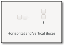
You can add child widgets to a Box by
calling the Add or PackStart
methods. Add(w) is equivalent to
PackStart(w, false, false, 0).
Box. Orientation
is an enumeration with values Horizontal
and Vertical. spacing
is the number of pixels to place by default between children in the
box.Box.expand is true, the child will
receive any extra space that is available. If more than one child
sets this option, then the extra space will be evenly divided among
them.fill is true, the child will occupy
any extra space it is given. If it is false, the extra space will
just be used as padding. (If expand is
false, then fill has no effect.)padding is the size (in pixels) of
extra space to place between this widget and its neighbors in the
box.A pushbutton.

Button with the given
label.A widget that displays a calendar and lets the user select a date.
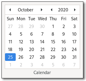
Calendar.A renderer that can display a column of data in a TreeView in textual format.
CellRendererText.A button that toggles a check mark.

The Active property (inherited from ToggleButton) indicates whether the button is currently checked.
A ColorChooserDialog lets the user select a color.
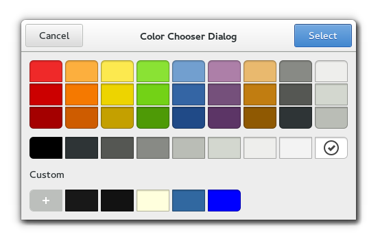
A ComboBoxText is a drop-down menu that lets the user select one of a series of text items.

An abstract base class for any widget that can contain other widgets.
Container.
Container.
(If you want to iterate over the children, there is no need to
access this property; Container implements IEnumerable, so you can
iterate over a Container directly.)A dialog box.
After you add child widgets to a dialog, you must
call the dialog's ShowAll() method if
you want the children to be visible.
flags will typically be
DialogFlags.Modal to create a modal
dialog.button_data indicates a set of buttons
to display at the bottom of the dialog. Each such
button is represented by a pair of values: a button
text string (e.g. "Add") followed
by a value to be returned if that button is selected
(typically a response code such as ResponseType.Ok
or ResponseType.Cancel). For example:Dialog d = new Dialog("My Dialog", this, DialogFlags.Modal,
"OK", ResponseType.Ok, "Cancel", ResponseType.Cancel);
ResponseType.Ok
or ResponseType.Cancel, cast to an int.Destroy()
to destroy it - otherwise it will remain visible on the screen.A DrawingArea is a
canvas where the program can draw graphics with Cairo. To draw on a
DrawingArea, override the OnDrawn method
and use the provided Cairo context to draw.

DrawingArea.An Entry is a box
where the user can enter a single line of text.

base.OnTextInserted(new_text, ref position);
A standard dialog box that prompts the user to select a file to be opened or created.
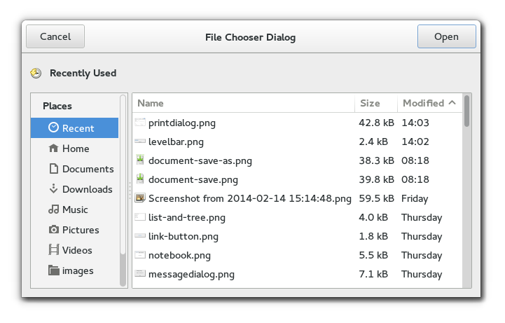
FileChooserDialog.title is a
string that will appear in the dialog box's title bar.parent is the top-level window that
will own this dialog, typically the application's main window.action is a FileChooserAction,
an enumeration whose values include Open
(open mode: the user can only choose
an existing file) or Save (save mode:
the user can either choose an existing file, or type in a new
filename).ResponseType.Ok
or ResponseType.Cancel).new FileChooserDialog(
"Open...", this, FileChooserAction.Open,
"Cancel", ResponseType.Cancel, "Open", ResponseType.Ok);
A Fixed is a container that holds child widgets at arbitrary positions that may overlap. You may add a child to a Fixed by calling Add(), which will add it at position (0, 0), or by calling Put() to add it at a specified position.
A Grid is a container that holds widgets arranged in rows and columns. Each widget may occupy one or more rows and columns in the grid. Rows and columns are indexed starting from 0.
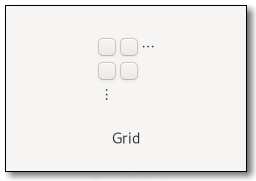
left and top
are the column and row indices of the upper-left corner of
the widget in the grid. width and
height are the number of colums and
rows that the widget will occupy.A widget that displays an image.

Image widget that will
display an image loaded from the given file in PNG or JPEG format.Image widget that will
display a stock icon. stock_id should
be one of the names defined in the Stock
class. size will typically be
IconSize.SmallToolbar if you are
creating an icon to display in a toolbar button.An interface implemented by classes that hold data
to be displayed in a TreeView. One such
class is a ListStore.
A widget that displays a text label, which is often a fixed string.

A ListStore holds
data that can be displayed in a TreeView.
ListStore whose columns will
hold the given types of data. For example:ListStore store = new ListStore(typeof(bool), typeof(string), typeof(int));
ListStore, and
return a TreeIter that points to it.ListStore.ListStore.A top-level menu or a submenu.
Menu.Menu.The menu bar that typically appears at the top of a window.

MenuBar.A MenuItem is an item
that appears in a menu. It may itself contain a submenu of
child MenuItem objects.
MenuItem with the given label.MenuItem fires when the
user selects it.MenuItem.A simple dialog box that displays a message, plus optional secondary text and one or more buttons.
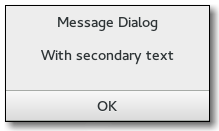
MessageDialog.flags will typically be
DialogFlags.Modal.MessageType, which is an
enumeration including values Info,
Warning, Question,
and Error. The dialog may display an
icon that depends on the message type.bt is a ButtonsType,
which is an enumeration including values Ok,
YesNo and OkCancel.
This value determines the button(s) that will be shown in the
dialog.format is a C# format string that may
include format items with optional formatting codes; for example, it
could be "name: {0}, score: {1:f2}".
These items will be replaced with the string representations of any
folllowing arguments.An enumeration with values Horizontal
and Vertical.
A button that appears in a group. When one radio button in a group is selected, the others are automatically deselected.
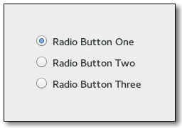
other.An enumeration of values that may be returned by a
GtkDialog, including Cancel and Ok.
A horizontal or vertical slider that lets the user select a number in a given range.

Scale. Orientation
is an enumeration with values Horizontal
and Vertical. The slider will let the
user select any value between min and
max. If the user selects the slider and
presses an arrow key, the number will jump by step.
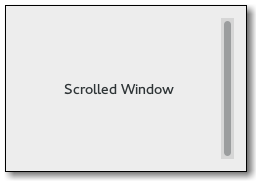
A widget that can display a scrolling view of its contents, showing scrollbars when necessary.
A horizontal or vertical separator line, useful for visually separating groups of controls e.g. in dialog boxes.
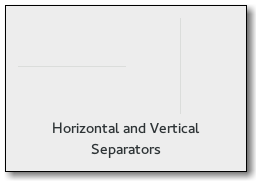
A SeparatorToolItem displays a separator line in a toolbar.
A spin button lets the user enter a number either by typing it into a text box, or by using buttons to adjust it.

min
and max. If the user presses one of the
buttons beside the text box, the number will increase or decrease by
step.A class with string fields naming particular
built-in icons. For example, Gtk.Stock.Delete
is the name of this icon, represeting a deletion action:
![]()
The exact appearance of this and other stock icons will depend on your operating system and icon theme.
Here is a complete list of the fields in this class.
A TextBuffer holds the text in a TextView.
start and end
to the beginning and end of the selected range.start
and end. include_hidden_chars
specifies whether invisible text will be returned; in most simple
uses of a TextBuffer, there will be no
such text, so this value does not matter.A TextIter represents
a position in a TextBuffer.
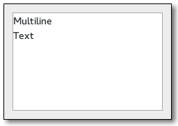
A TextView is a
multiline text editor widget.
A ToggleButton is like a Button, but remains pressed in after the user clicks it. If the user then clicks it again, it will return to its original unpressed state.

A ToggleToolButton is like a ToolButton, but can be in one of two visible states: either it is pressed in or it is not. By default, its state toggles when the user clicks it.
ToggleToolButton. Unlike the
ToolButton constructor, this
constructor does not take a Widget
argument, but you may add a widget to the button by setting the
IconWidget property.A Toolbar displays a
set of buttons in a single row or column.

Orientation.Horizontal or
Orientation.Vertical.ToolbarStyle.Icons
to display only icons, ToolbarStyle.Text
to display only text, or ToolbarStyle.Both
to display both.A toolbar button.
Image) and optionally display a string
label.An abstract base class for items that can appear
in a toolbar, such as ToolButton and
SeparatorToolItem widgets.
A TreeIter is a
pointer to a particular node in a TreeModel,
such as a row in a ListStore.
A list of integers representing the path from the
root to a particular node in a TreeModel.
If the model is a ListStore, this will
just be a single integer representing a row index.
ListStore,
this will be an array of length 1.)A TreeSelection
manages row selection in a TreeView.
TreePath objects,
one for each row that is currently selected.SelectionMode.Single,
indicating that only one row may be selected at a time, or
SelectionMode.Multiple, allowing
multiple selection.A TreeView displays a
list or tree of data in columns.

RowActivatedHandler
is a delegate type:delegate void RowActivatedHandler(object o, RowActivatedArgs args);
RowActivatedArgs has fields Path
(a TreePath) and Column
(a TreeViewColumn).TreeSelection object for this
TreeView.A column to be displayed in a TreeView.
TreeViewColumn, including a
CellRenderer and one or more
attributes. Typically you will specify an attribute indicating the
index of the model column containing the data that the CellRenderer
should display. For example: TreeViewColumn col = new TreeViewColumn("name", new CellRendererText(), "text", 0);
SortType
is an enum with values Ascending and
Descending.A widget is a visual element such as a button, check box, scrollbar, or text area. (In Windows programming these are called controls, but "widget" is the usual Unix term.) A top-level window also counts as a widget.
Gdk.EventMask, which is an
enumeration with one value for each possible event type. For
example:AddEvents((int) (EventMask.ButtonPressMask |
EventMask.ButtonReleaseMask |
EventMask.PointerMotionMask));
Allocation property is a
Gdk.Rectangle representing the widget's
current size and position within its parent widget.Window,
then Allocation.X and Allocation.Y
will be 0, and Allocation.Width and
Allocation.Height will be the size of
the client area of the window.delegate void KeyPressEventHandler(object o, KeyPressEventArgs args);
KeyPressEventArgs has a field Event
of type EventKey.OnKeyPressEvent method
rather than adding a handler for this event.)Window, this handler will be called
when the user has resized the window.OnDrawn handler in the near
future.A window that appears on the user's desktop.

There's also a Window class in the Gdk namespace, so you will probably want to choose this one explicitly:
using Window = Gtk.Window;
A Window can directly contain only a
single widget. To hold more widgets, add a container widget such as a
Box and place the child widgets in that
container.
ShowAll()
to make it appear.